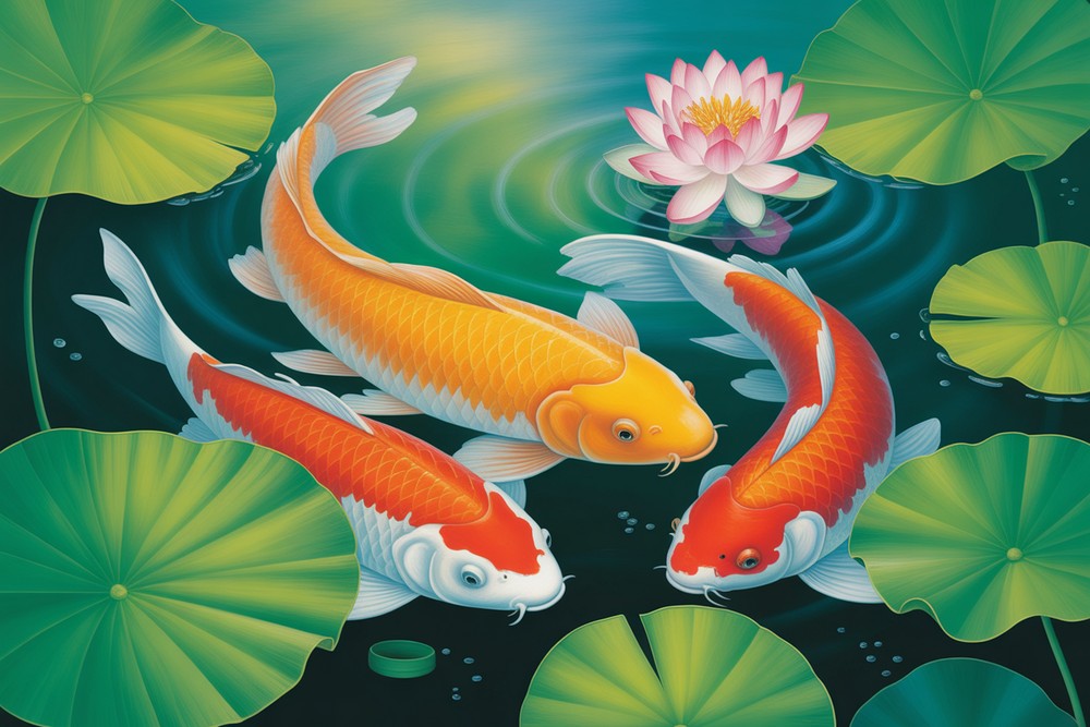
Peaceful Koi Pond Acrylic Painting For Beginners
Paint a calm koi pond that glows with soft light, lily pads, and gliding fish. This beginner-friendly acrylic project teaches layering, glazing, and simple textures so your water feels deep and alive. We’ll start with an easy turquoise gradient, place lily pads, and add a single pink waterlily as the star. Then you’ll block in koi shapes and build colors slowly, finishing with shimmering highlights and ripples. The steps match the photos you see, so follow along at a relaxed pace. You’ll use only a few common brushes and straightforward color mixes. By the end, you’ll have a peaceful painting that looks complex but came together with clear, simple moves. Hang it in a quiet corner, gift it to a friend, or keep learning by experimenting with different koi patterns.
Supplies for This Drawing
- Canvas: 9×12 in (A4 approx.) or 11×14 in, cotton, primed
- Acrylic paints: phthalo blue (green shade), ultramarine blue, teal, sap green, olive green, yellow ochre, burnt umber, magenta/quinacridone rose, cadmium orange (hue), titanium white, mars black (optional)
- Brushes: 1″ flat, ½” flat, filbert size 6–8, round size 4, liner/rigger
- Palette, palette knife, water pot, paper towels, spray bottle
- Optional: glazing medium, satin varnish, white gel pen for micro dots
Prepare the Materials
- Tape edges or paint wrap-around.
- Arrange paints from light to dark.
- Pre-moisten brushes; fill spray bottle.
- Place reference images where visible.
- Test mixes on a scrap.
- Keep two water cups—one for rinse, one for clean.
- Set a hair dryer nearby for quick drying.
Special Features of This Drawing
- Serene turquoise gradient suggesting clear pond depth
- Layered lily pads with veins, rims, and dew drops
- A single focal waterlily balancing warm pinks against greens
- Koi built from soft silhouettes to vivid patterned color
- Reflections, bubbles, and sparkle for motion and light
- Gentle glazing to seat fish beneath the surface
Tutor’s Suggestions
- Work thin to thick: glazes first, opaque accents last.
- Keep pads organic—avoid perfect circles.
- Vary koi scale and direction for a natural school.
- Use a mop or soft makeup brush to blur water softly.
- Reserve your pure white for the very final sparkles.
- Step back often; squint to judge value contrast.
- If something feels busy, soften edges instead of repainting.
Uses
- Relaxing wall art for living room or studio
- Class project introducing glazing and reflections
- Handmade gift for a housewarming
- Journal or calendar cover art
- Practice piece before larger koi pond paintings
Level of Difficulty
Beginner-friendly — simple shapes, forgiving glazes, and clear layering lead to polished results.
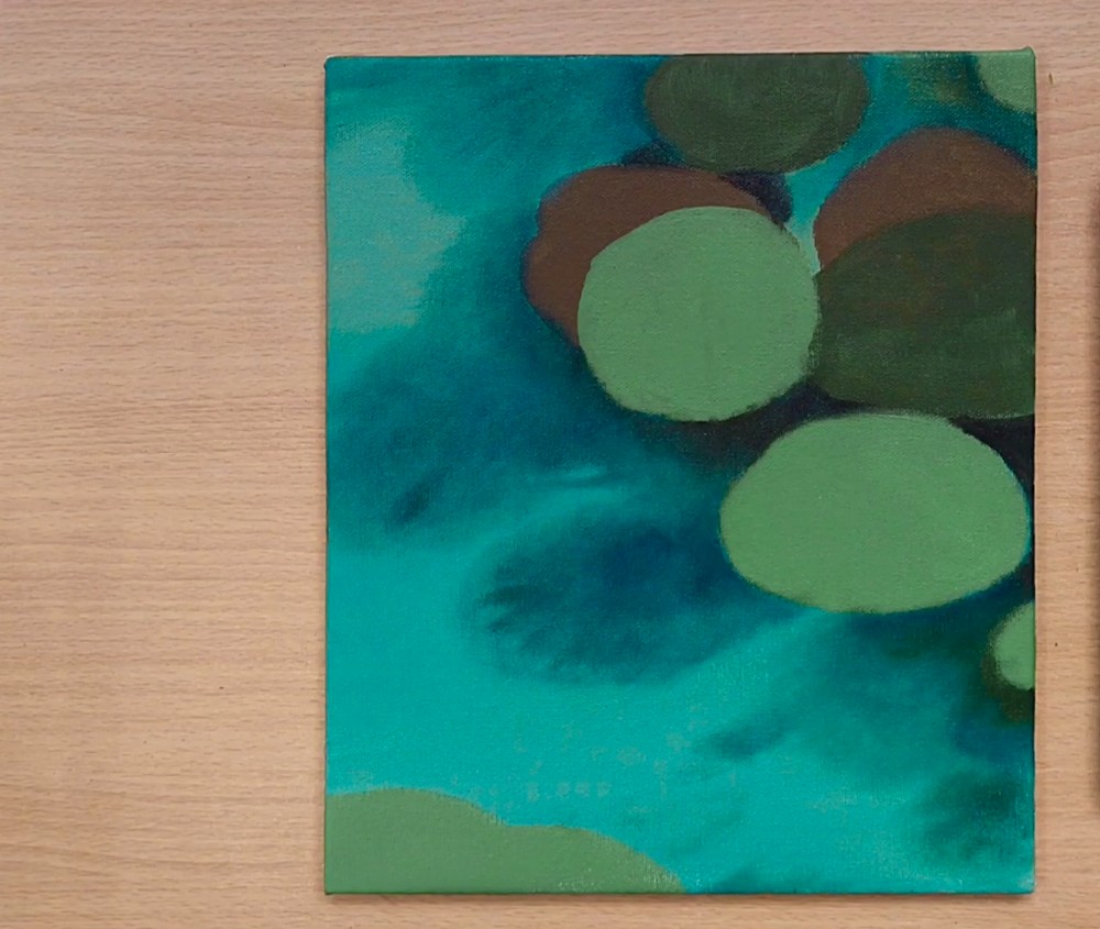
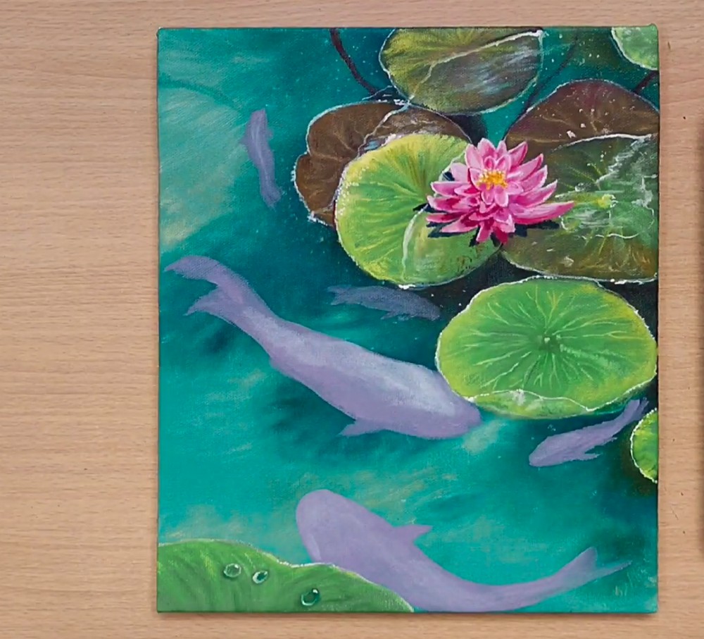
Turquoise Ground
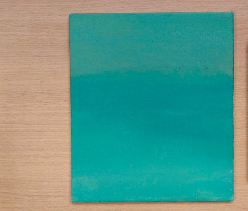
Paint the canvas with a smooth aqua gradient for water. Mix phthalo blue, teal, and a touch of titanium white. Keep the top slightly darker and the bottom lighter to suggest depth. Use horizontal strokes with a wide flat brush. Soften transitions by lightly misting water or dry-brushing. Let this underpainting dry before moving on. Thoroughly cover edges for a finished look.
Pad Placements
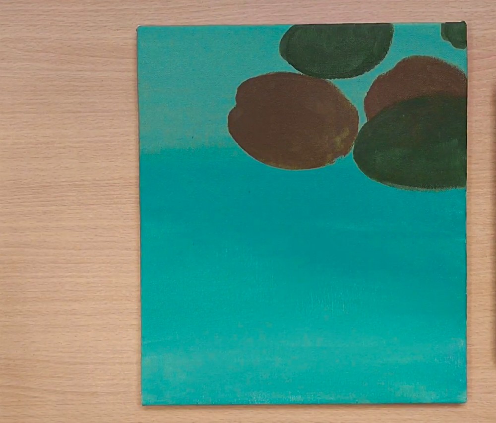
Block in approximate lily pad positions with dark shapes near the upper right. Mix burnt umber with ultramarine to create deep, murky ovals. Keep edges soft and uneven; they are only placeholders. Vary sizes for perspective. Leave plenty of open water for fish later. Maintain the gradient by feathering color outward so nothing looks pasted on. Add faint halos for subtle depth.
Mid-Tone Leaves
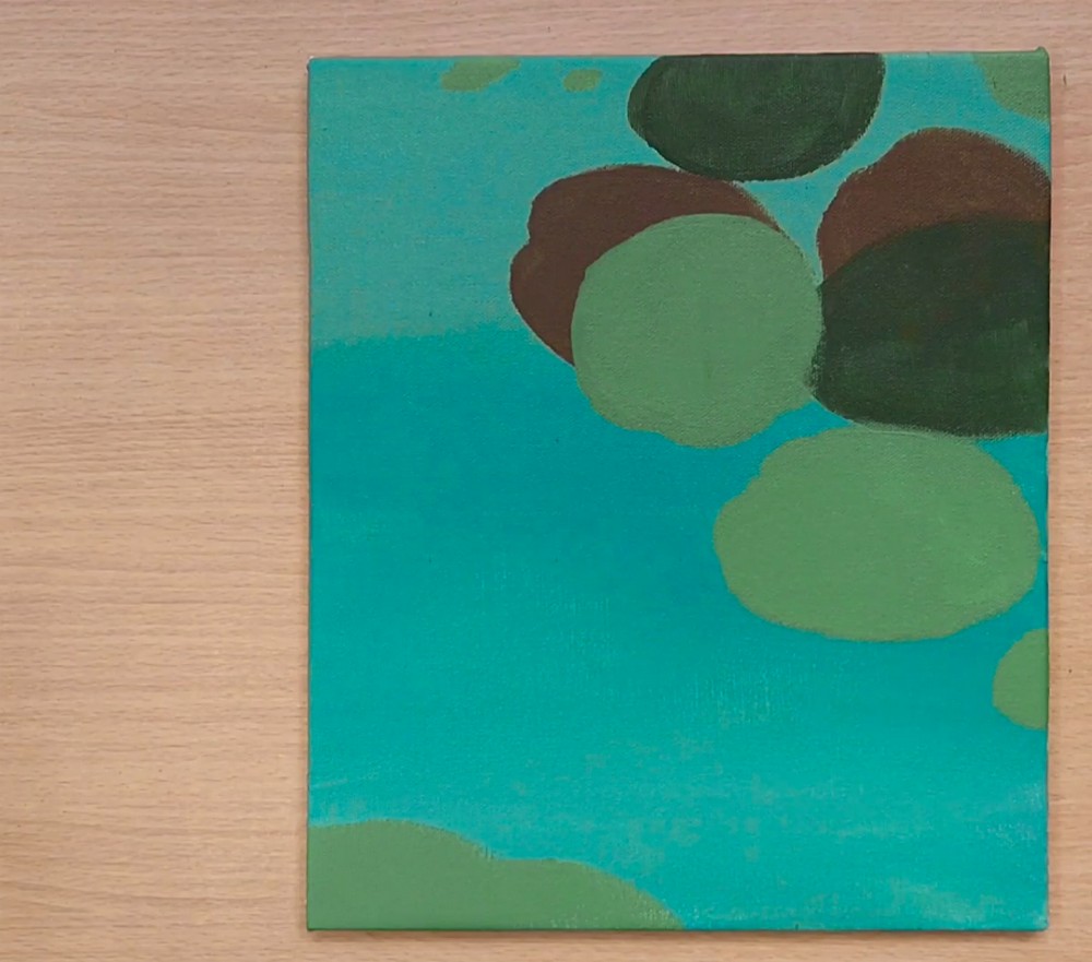
Lay in mid-tone leaf bases using sap green plus yellow ochre. Paint round, slightly flattened circles overlapping earlier shadows. Add a foreground pad along the lower edge to anchor composition. Keep coverage thin so the background glow peeks through. Work wet-into-wet to blend rims softly. These flat colors will support later veins, texture, and highlights. Leave small gaps of water between shapes.
Water Movement
Glaze translucent turquoise around and beneath the pads to create movement in the water. Use a soft mop brush and gentle, swirling strokes. Darken pockets to suggest depth, and keep a few lighter streaks for sunlit ripples. Lift paint with a clean damp brush to form soft pools. Everything should feel watery, not outlined. Feather edges continually and preserve earlier gradients underneath.
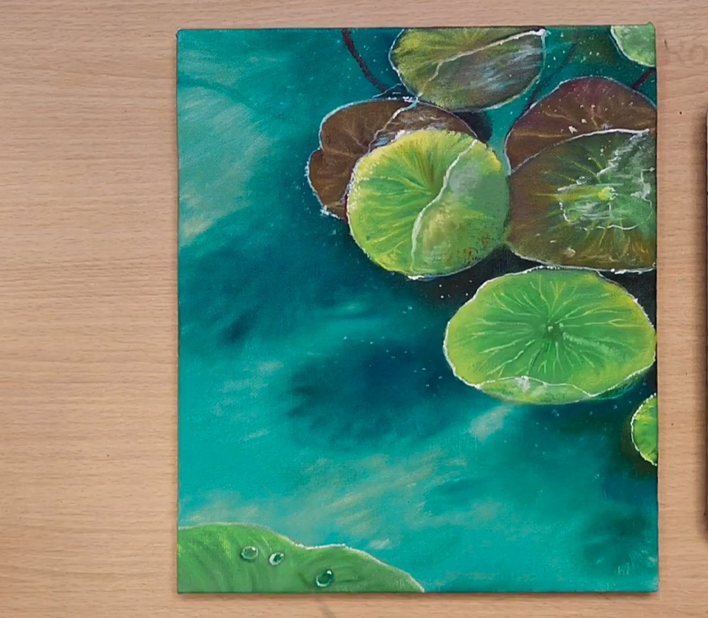
Leaf Details
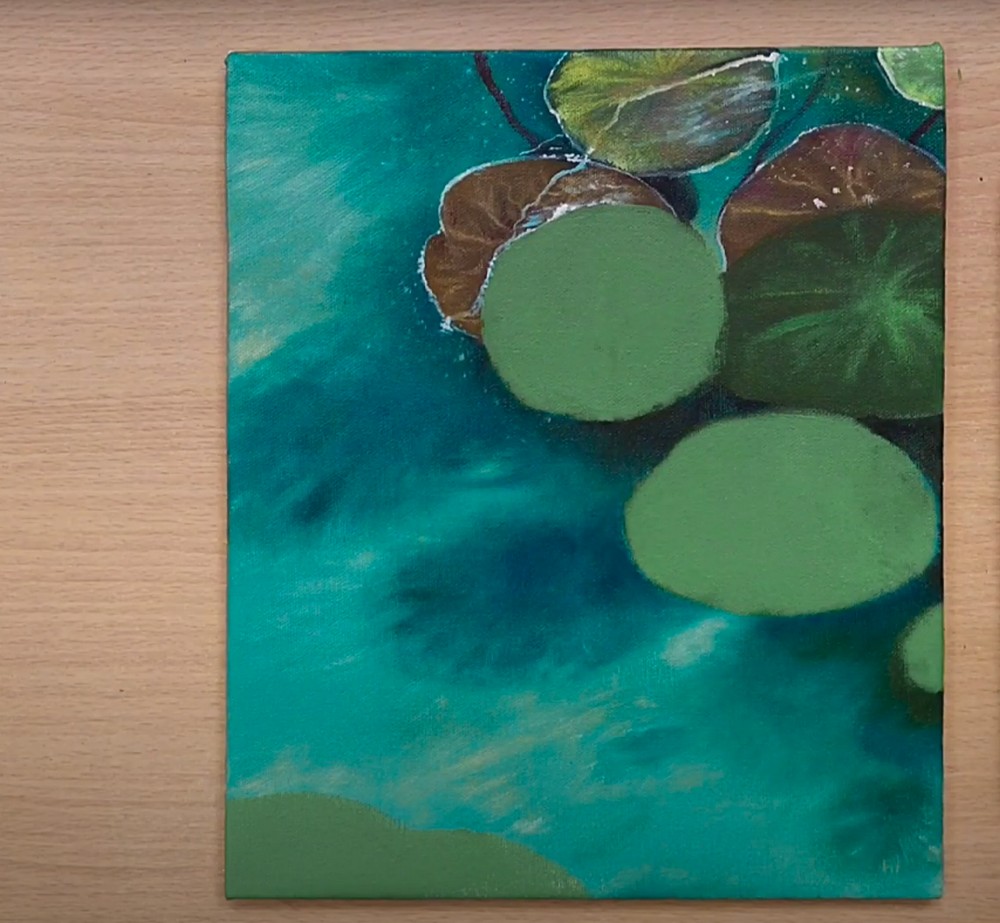
Begin defining leaves. Mix olive green with white for the sunward side and add a cool green for shadowed halves. Pull radiating veins from the center with a liner brush. Edge a few rims with pale yellow to catch light. Add tiny splashes and specks for pond sparkle. Suggest droplets on the nearest pad with bright highlights. Keep midtones soft and rounded.
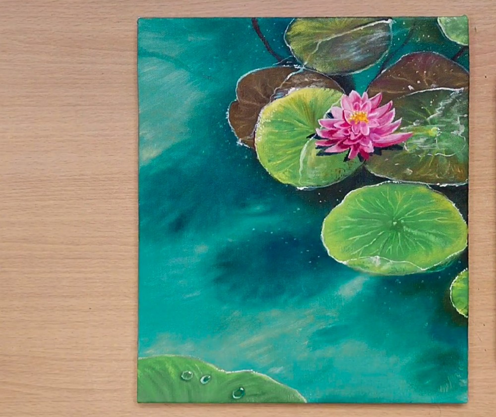
Waterlily Bloom
Paint a blooming waterlily. Sketch dark center shapes, then layer petal wedges using magenta, quinacridone rose, and white. Angle outer petals flatter; stack inner ones upright for depth. Leave slim dark gaps between petals. Glaze warm yellow near the heart to glow. Set cast shadows onto the pad below so the flower sits convincingly in space. Add specks of pollen for sparkle.
Koi Underpaint
Map the koi with soft, simplified silhouettes beneath the water’s surface. Mix ultramarine, crimson, and white to make a muted violet-gray. Keep edges hazy and tails tapering. Vary sizes and directions to suggest a school. Place the largest fish near the bottom left for foreground interest, curving along the flow. Reserve bright markings for later layers. Indicate fins with quick transparent swipes.
Color the Koi
Develop the koi. Layer opaque white patches first, then warm oranges and reds over select areas, keeping bellies lighter. Use short, curved strokes to follow forms. Add dark eyes and gentle mouths. Glaze thin teal across backs to place them underwater. Strengthen reflections beside them with bright streaks and bubbles so energy ripples through the pond. Deepen shadows under fins for contrast.
Final Sparkle
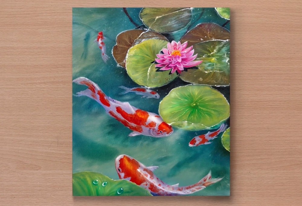
Finish with crisp details. Dot tiny white sparkles along lily rims and water trails. Reinforce brightest highlights on koi noses and petal tips facing the light. Add soft particulate specks in the water and a few thin stem lines. Adjust edges: sharpen focal elements, blur distant pads. Varnish after drying to enrich colors and create glassy depth. Step back and balance values.
Conclusion
Take your time watching the scene develop: gentle water, floating leaves, radiant flower, and elegant koi. Acrylic’s quick drying helps you layer confidently, fix mistakes, and enhance glow with glazes. Don’t chase perfection; suggest movement and let edges dissolve. Step back often, squint, and balance contrast. Your finished pond should feel calm, bright, and refreshingly alive on your wall today.
A Bonus Tip
Dry-brush a whisper of titanium white along select ripples beside koi bodies—the contrast sells translucency and motion instantly.
FAQs
Q: How long will this take?
A: About 90–150 minutes, depending on drying time and how many details you add.
Q: What canvas size works best?
A: 9×12 in (A4) or 11×14 in keeps brushes manageable while leaving room for fish and pads.
Q: My water looks flat—help!
A: Add value shifts with thin teal/ultramarine glazes, then lift a few soft streaks with a damp brush.
Q: Should I outline the pads?
A: Avoid heavy outlines. Instead, brighten rims with pale yellow-green and deepen the adjacent water to separate shapes.
Q: Which order should I paint the koi colors?
A: Underpaint silhouettes, add opaque whites, layer oranges/reds, then glaze cool teal across backs and finish with tiny highlights.
Q: Can I use student-grade paints?
A: Yes. Boost vibrancy by glazing multiple thin layers rather than one thick coat.